-
🎨 CSS 4 | Flexbox (with 드림코드 by 앨리) 2탄CSS 2022. 9. 5. 23:25
Step 4: Flexbox 자식에게 줄 수 있는 속성들 (item)
HTML 문서 작성
<!DOCTYPE html>
<html lang="ko">
<head>
  <meta charset="UTF-8">
  <meta http-equiv="X-UA-Compatible" content="IE=edge">
  <meta name="viewport" content="width=device-width, initial-scale=1.0">
  <title>flex-item편</title>
</head>
<body>
  <div class="container">
    <div class="item item1">1</div>
    <div class="item item2">2</div>
    <div class="item item3">3</div>
  </div>
</body>
</html>
CSS 작성
.container {
  padding-top : 100px;
  background : beige;
  height: 100vh;
  display : flex;
}
.item {
  width: 40px;
  height: 40px;
  border : 1px solid black;
}
.item1 {
  background-color: rgb(247, 114, 114);
}
.item2 {
  background-color: rgb(250, 134, 153);
}
.item3 {
  background-color: rgb(165, 100, 250);
}
- order
default 값 : 0;
순서 임의로 지정하기
.container {
  padding-top : 100px;
  background : beige;
  height: 100vh;
  display : flex;
}
.item {
  width: 40px;
  height: 40px;
  border : 1px solid black;
}
.item1 {
  background-color: rgb(247, 114, 114);
  order : 2;
}
.item2 {
  background-color: rgb(250, 134, 153);
  order : 1;
}
.item3 {
  background-color: rgb(165, 100, 250);
  order : 3;
}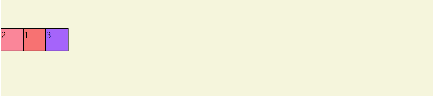
- flex-grow
default 값 : 0; 자신의 고유한 사이즈 유지
flex-grow 값 지정하기 : 화면이 커질 때 해당 비율만큼 늘어남
.container {
  padding-top : 100px;
  background : beige;
  height: 100vh;
  display : flex;
}
.item {
  width: 40px;
  height: 40px;
  border : 1px solid black;
}
.item1 {
  background-color: rgb(247, 114, 114);
  flex-grow : 1;
}
.item2 {
  background-color: rgb(250, 134, 153);
  flex-grow : 2;
}
.item3 {
  background-color: rgb(165, 100, 250);
  flex-grow : 3;
}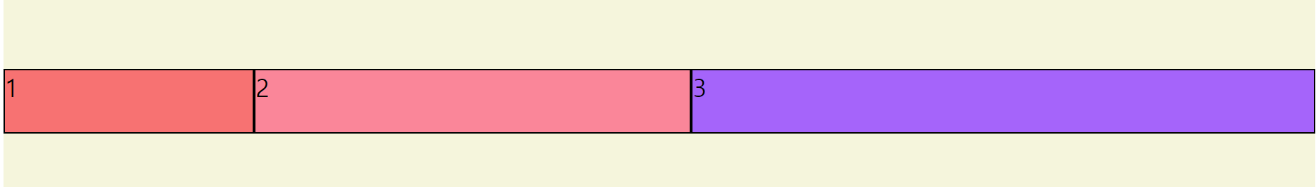
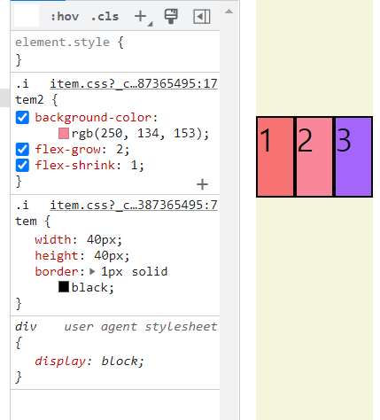
- flex-shrink
default 값 : 0; 자신의 고유한 사이즈 유지
flex-shrink값 지정하기 : 화면이 줄어들면서 해당 비율만큼 줄어듦
.container {
  padding-top : 100px;
  background : beige;
  height: 100vh;
  display : flex;
}
.item {
  width: 40px;
  height: 40px;
  border : 1px solid black;
}
.item1 {
  background-color: rgb(247, 114, 114);
  flex-grow : 1;
  flex-shrink : 1;
}
.item2 {
  background-color: rgb(250, 134, 153);
  flex-grow : 2;
  flex-shrink : 1;
}
.item3 {
  background-color: rgb(165, 100, 250);
  flex-grow : 3;
  flex-shrink : 1;
}
화면이 커질 때 (flex-grow 비율로)
화면 크기가 줄어들 때 (flex-shrink 비율로)
- flex-basis
default 값 : auto; flex-grow, flex-shrink 에 맞게
flex-basis 값 지정하기 : flex-grow, flex-shrink가 없을 경우, flex-basis 에 지정된 비율만큼 차지.
.container {
  padding-top : 100px;
  background : beige;
  height: 100vh;
  display : flex;
}
.item {
  width: 40px;
  height: 40px;
  border : 1px solid black;
}
.item1 {
  background-color: rgb(247, 114, 114);
  flex-basis: 60%;
}
.item2 {
  background-color: rgb(250, 134, 153);
  flex-basis: 30%;
}
.item3 {
  background-color: rgb(165, 100, 250);
  flex-basis: 10%;
}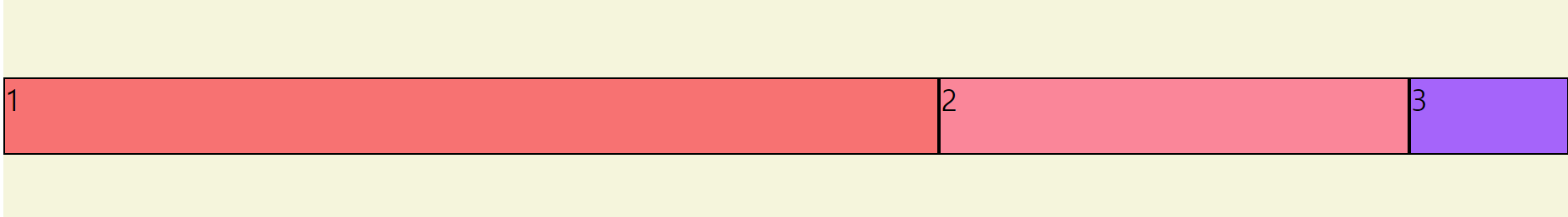
-align-self
default 값 : auto;
align-self : 아이템 별로 아이템의 align 지정
.container {
  padding-top : 100px;
  background : beige;
  height: 100vh;
  display : flex;
}
.item {
  width: 40px;
  height: 40px;
  border : 1px solid black;
}
.item1 {
  background-color: rgb(247, 114, 114);
  flex-basis: 60%;
  align-items : center;
}
.item2 {
  background-color: rgb(250, 134, 153);
  flex-basis: 30%;
}
.item3 {
  background-color: rgb(165, 100, 250);
  flex-basis: 10%;
}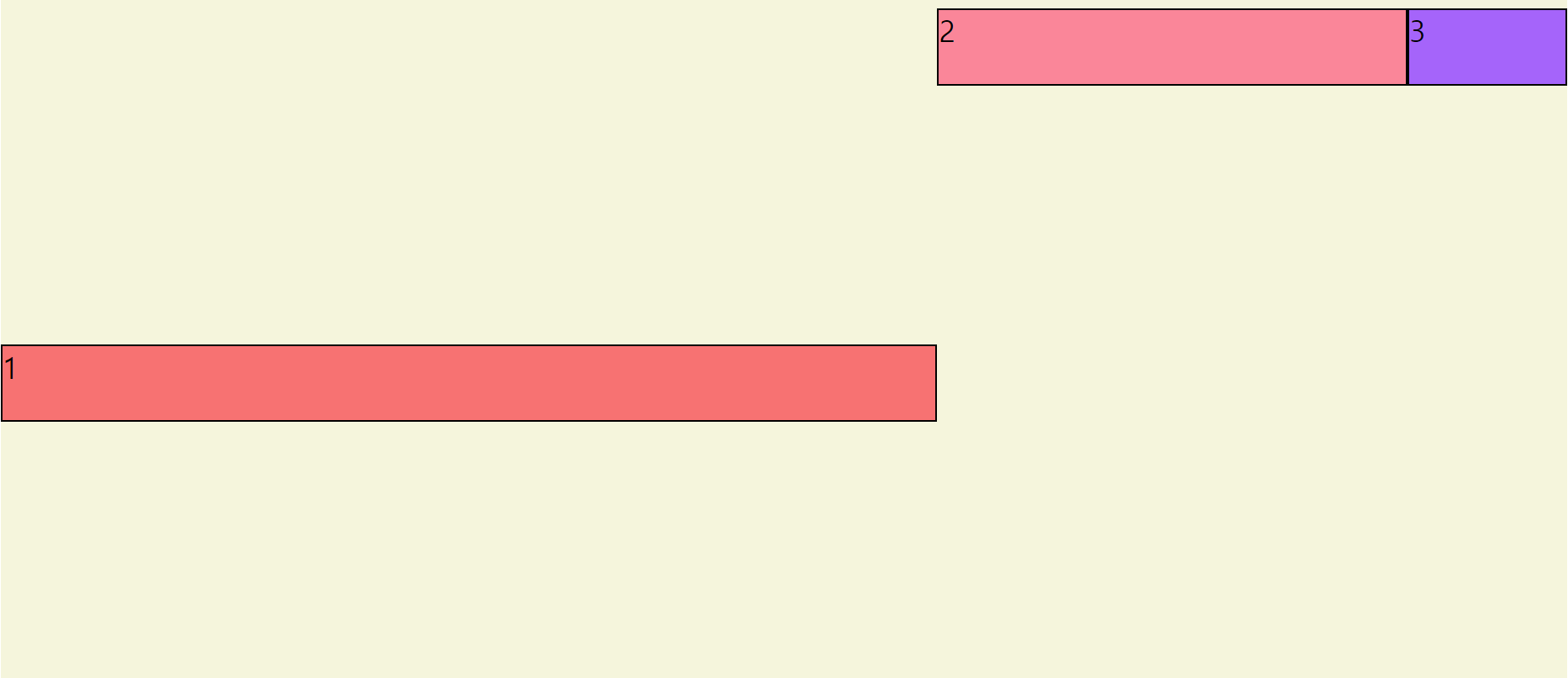
단축형
flex : 2 2 auto /*grow, shrink, basis*/A Complete Guide to Flexbox | CSS-Tricks
Our comprehensive guide to CSS flexbox layout. This complete guide explains everything about flexbox, focusing on all the different possible properties for the parent element (the flex container) and the child elements (the flex items). It also includes hi
css-tricks.com
'CSS' 카테고리의 다른 글
🎨 CSS 6 | 그리드(with 드림코드 by 앨리) 2탄 (0) 2022.09.09 🎨 CSS 5 | 그리드(with 드림코드 by 앨리) 1탄 (0) 2022.09.09 🎨 CSS 3 | CSS 단위 ( %, em, rem, vw, vh ) (0) 2021.12.17 🎨 CSS 2 | Flexbox (with 드림코드 by 앨리) 1탄 (0) 2021.12.17 🎨 CSS 1 | CSS layout (display, position) (0) 2021.12.16